Critical reading
Il cuore esposto: red at the centre of dark planes
An irregular red field remains exposed among broad grey-black forms. The work builds tension through adjacency, openings and a concentrated colour contrast.
Critical Reading
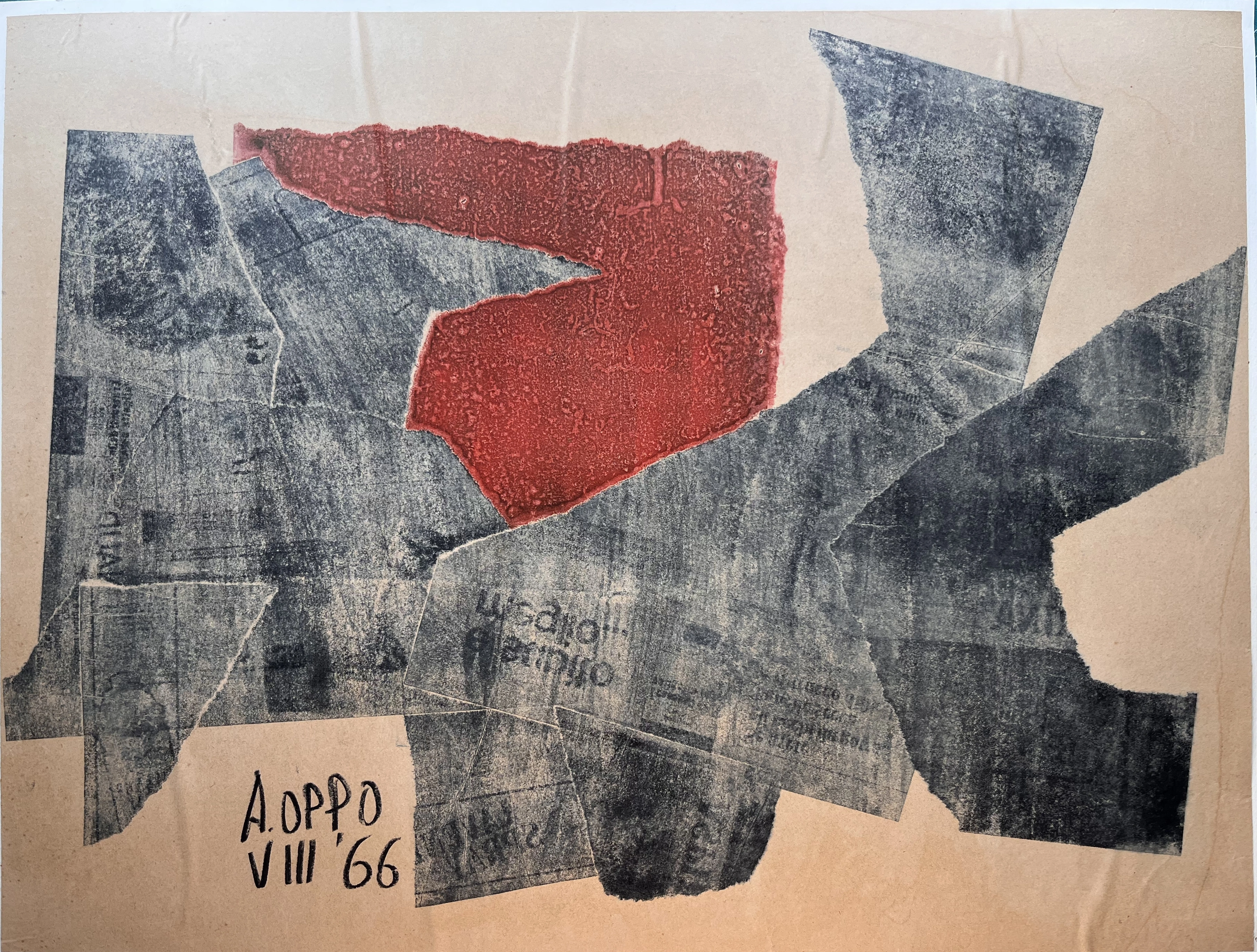
The record for Il cuore esposto dates the work to 1966. The photograph shows an irregular red field just above centre, between broad grey-black planes against a pale ground. A dark form from the left points towards red, while another rises obliquely from the right and grazes its base. These masses do not close the coloured area completely; they let it emerge in an opening. At lower left, signature and ‘VIII ’66’ inscription can be read. The title is an Archive designation, and medium is unspecified. Description therefore stays with visible relations among surfaces, edges and colour.
Red does not occupy most of the image but sets its perceptual centre. Its granular surface ranges from brick to brighter vermilion. The upper edge is almost horizontal but jagged; on the left it receives an advancing grey point; below it descends towards interlocked dark planes. This is neither a circle nor an anatomical figure. ‘Heart’ in the title proposes a metaphor for concentration, not an identification of a painted organ. The red form becomes decisive because it is the only large warm area within a structure dominated by grey and black.
Dark surfaces have different weights. On the left, a broad mass divides into paler and deeper planes; on the right an oblique arm crosses the composition and meets a larger element climbing to the upper corner. An inclined grey rectangle lies at lower centre before other black zones. Joins make a complex weave but do not erase the main movement: edges converge towards red. Some profiles are sharp, others worn or broken. This alternation keeps construction from becoming regular geometry and makes work on the surface perceptible.
Pale ground is visible especially at the margins and in some slits between planes. Unlike red, it does not concentrate attention in one place; it measures the black structure’s spread. Broad masses seem to fill almost the width but remain separated from the image edge by varying pale strips. Composition is thus open without becoming dispersed. Red is a knot; white margins and smaller voids let the eye recover contours even where dark surfaces overlap and seem to lose a definite direction.
‘VIII ’66’ anchors the work to a particular moment in the year but does not recount its subject. The Archive title works if it refers to the effect of exposure: an intense area remains in view within planes that could have hidden it. Painting, however, imitates no anatomical casing. It shows how colour can seem vulnerable and dominant at once. Red is surrounded, visually cut into by a grey point, yet remains the strongest focus. Tension grows from that relation between apparent protection and unavoidable visibility.
Critical Aspects
The work’s centre is not a perfectly closed form. Grey edges nearing red visually cross it and change its appearance according to what bounds it: brighter against deep black, more restrained where it touches pale grey. Dark masses are therefore no neutral backdrop. They determine the extent and rhythm of colour. The picture shows how one relatively simple chromatic area can hold a complex ensemble when its boundaries are continually contested. Pale ground joins the play, preventing outer planes from sealing into a final frame.
Comparison with Monolite abitabile is supported by the date and ‘VIII ’66’ inscription visible in both photographs. There, too, broad dark planes cluster on a pale ground, but the centre is a white gap dividing a vertical form. Il cuore extends horizontally and centres on a red mass. One work activates subtraction, the other chromatic concentration. Temporal proximity is documented; it does not prove they were conceived as a pair or for one exhibition. The comparison serves their different compositional solutions.
In Custodia del rosso, also from 1966, dark forms surround a broad red area, compressing it and breaking its perimeter. The chromatic relation is close, but the images are not equivalents. In Custodia, red covers a larger, more uniform area, almost a broad rounded core within black bands. In Il cuore, red sits higher and has a more jagged edge, while grey forms interlock in several directions around it. Comparison shows how warm colour and dark masses could produce different effects of containment and opening in the same year.
Grey-black is not an even range. Some planes appear almost charcoal-like; others show pale rubbings, textures and thin lines. The reproduction suggests overlapping surfaces and a strong tactile difference from red but cannot securely identify materials and process. No technique is specified in the record. We must distinguish what the image shows, an effect of stratification, from a material diagnosis requiring direct study. Reading remains firm without the latter: energy comes from contrast between a relatively continuous colour area and an outline made of parts.
Dark planes’ obliqueness creates movement beyond a simple convergence on the centre. A point enters red from the left, a wide band rises from the right, and an inclined rectangle occupies the base. The eye is led to the warm zone and immediately sent back to the edges by diverging directions. Red, by contrast, holds it. Opposition between circulation and arrest makes the image more dynamic than its large blocks suggest. The visual ‘heart’ pulses not through narrative but because our gaze keeps returning to it.
Augusto Oppo’s biography gives context for his activity but attributes no private episode or documented emotion to this work. ‘Heart’ remains an interpretative key from the Archive. Marks resembling letters in some grey areas also do not authorize transcription or a certain message from the photograph. Verifiable data suffice for analysis: inscribed year and month, red zone, dark plane structure and pale margin. In their relation, not an assumed biographical explanation, the work defines its character.
Evaluation
Il cuore esposto succeeds through the force of one chromatic accent. Red emerges decisively but is not merely laid on black: planes approaching it measure and alter it. Their oblique weave avoids symmetry and makes the centre a site of pressure. Pale ground at the edges lightens the structure and keeps its articulations legible. From afar the picture seems immediate; close up it reveals joins and tonal changes that prolong attention.
The catalogue title offers an apt metaphor for red’s visibility provided we do not seek an organ or sentimental story in the image. The work speaks through formal means: one warm colour, many cool or neutral surfaces, points and slits modulating their meeting. The effect is energetic and restrained at once. Red commands the gaze, while greys compel it to check continually where the red begins and ends. This resistance of the outline prevents composition from becoming merely decorative contrast.
Monolite abitabile and Custodia del rosso help situate the work among Oppo’s 1966 experiments with mass, void and chromatic accent. Il cuore has its own solution: neither a white opening at the centre nor one nearly uniform large red core, but an irregular warm field caught among diverging dark planes. A shared month with Monolite heightens the comparison’s interest without authorizing a common production history. Its most persuasive result is the balance of red’s immediacy with the complexity of the construction allowing it to appear.