Critical reading
Stain, gesture and red accent
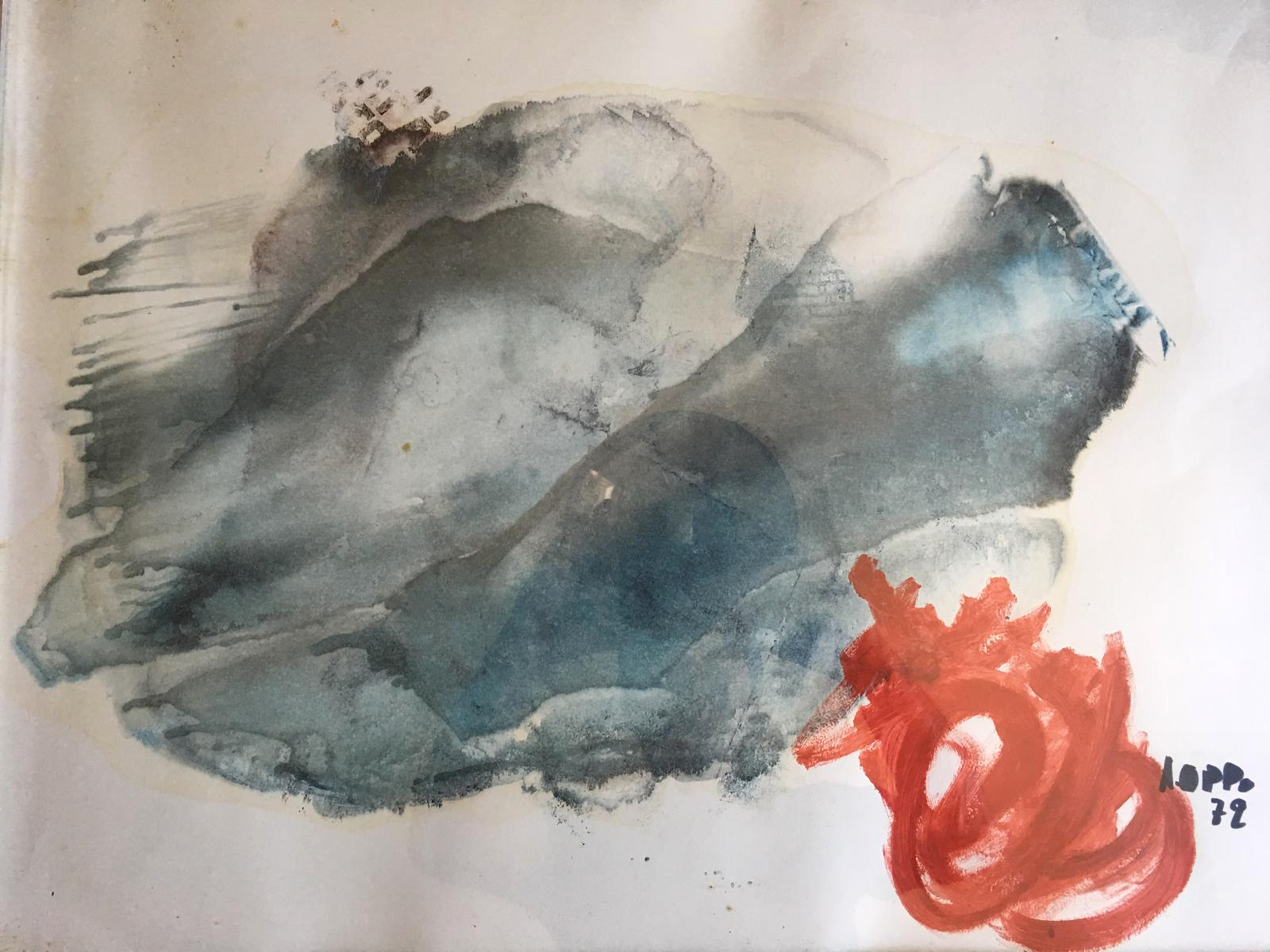
A grey-blue field and a red knot build an asymmetrical balance. The reading distinguishes received data, observation and dating to be verified.
Critical reading
The composition is organized around a large field of grey-blue shapes, crossed by inclinations and overlaps, to which a red presence concentrated in the lower right corner responds. The light background remains visible between the fields and along various margins: it participates in the construction of the image, allowing masses that might otherwise weld into a single block to breathe. The work entry preserves the distinction between descriptive designation and documented title. In fact, no artist-given title is available; calling the work a “composition” describes its visible organization without assigning it a certain subject.
The larger fields do not all possess the same consistency. Some appear more compact and dark, others allow the brightness of the support to emerge; their boundaries alternate between shaded areas, jagged edges, and sharper transitions. The color thus seems to shift between extension and thickening. At the top and towards the right, there are lightened areas that lighten the mass; in the center, a more intense blue zone produces an internal counterweight. These are relationships observable in the photograph, while the precise execution procedure cannot be reconstructed from the appearance of the surface alone. The mixed media and the card support derive from the submission information.
On the left side, a succession of thin marks introduces a rhythm different from that of the broad washes. These almost parallel traces reach towards the edge and make a direction perceptible, without transforming into a regular pattern. Their size changes: some are short, others accompany the movement for a longer stretch. The relationship between line and field prevents the surface from remaining uniform. The gaze can follow the minute marks, then return to the large light and dark shapes, recognizing a continuity that does not eliminate the differences between the various ways of marking.
The red shape introduces an immediate chromatic accent, but its peripheral position makes its function complex. It is energetic enough to attract attention and compact enough to let the grey-blue field predominate. Its windings, light voids, and variations in density suggest a more concentrated gesture. It is not necessary to recognize a flower, a face, or an object in it to describe its effect: the work gains strength precisely in the relationship between a large cold extension and a warm focal form, placed at different scales. This reading remains an interpretation of formal relationships, not the identification of an intention declared by the author.
Critical aspects
One of the most interesting aspects is the unequal distribution of weight. The main mass occupies a large portion of the sheet; the red, despite being more limited, possesses a strong visual pull. The balance therefore does not derive from symmetry or equality of quantities. It depends on the comparison between extension, intensity, and placement. The light background intervenes as a further variable: it separates some parts and connects others, keeping the intervals visible. The surface can be read through this continuous negotiation, in which no element simply coincides with a decorative function added to the rest.
The relationship between center and margin also deserves attention. The lateral marks suggest a push towards the outside, while various internal curves bring the gaze back towards the body of the composition. The red touches the lower margin of the received photograph: that contact must be described as it appears, without inventing a continuation of the painting beyond the available image. The reproduction does not allow for the establishment of every characteristic of the physical edges of the support. This documentary limit invites a measured reading: what we see allows us to study the tension of the framing, but does not authorize us to reconstruct absent parts.
In the lower right, the signature and a two-digit date are present in the original photograph. The reading adopted by the Archive is “72”, rendered in the entry as 1972 to be verified; the submission initially reported a different year, preserved in private notes. The contrast between the two indications makes explicit caution necessary. It would not be correct to transform the greater readability of the reproduction into a definitive historical confirmation. A direct examination of the work or further documentation could clarify the dating. In the meantime, criticism can describe the visual relationships without attributing to them a chronology more certain than that actually available.
The combination of gesture, wash, and pause can be compared with other works collected in the Archive works, keeping comparison and dependency distinct. Similarities in color or layout do not by themselves demonstrate an evolutionary sequence, an original group, or a common episode of execution. Here, we are interested above all in the ways in which an abstract surface preserves a variety of events: elongated strokes, thickenings, openings, and irregular edges. The multiplicity remains readable because the parts do not all compete on the same plane; some build a field, others interrupt it or specify its direction.
Evaluation
The value of the composition emerges from the ability to relate different qualities without resolving them into a repeated motif. The grey-blue zone proposes a more extended duration of the gaze, made of gradual transitions and reprises. The red acts instead as a concentration, a point of return from which to reconsider the whole. The linear traces add a finer rhythm. This articulation allows for successive readings: the first chromatic impression can be followed by the observation of the margins, the examination of the voids, and finally the verification of the small internal differences within the same field.
A responsible evaluation must, however, recognize what the photograph does not provide. The composition of the materials, the real depth of the layers, or any transformations undergone by the surface cannot be documented with certainty. The owner's declaration regarding the technique remains recorded information, not a result of material analysis. Even variations in tone and small irregularities can depend on the photographic lighting, the state of the support, or the execution. For this reason, the preparation of the image maintains the marks visible in the photograph and applies only moderate corrections, avoiding reconstructions that would give a false impression of evidence.
Considered within these limits, the work offers a particularly clear comparison between the energy of the marks and the balance of the composition. It does not require an external narrative to be articulated: it is the reciprocal dimensions of the shapes, the chromatic relationships, and the presence of the background that support its reading. The red does not close the path definitively, but reopens it towards the larger zone, where every return brings out a different passage. The composition thus preserves a mobile tension. Its effectiveness lies in the possibility of combining an immediate impression with a slow observation, without exhausting itself entirely in one or the other.