Research · Atlas · Comparisons
Augusto Oppo and Günter Fruhtrunk: diagonal, rhythm and structural colour
Six works from the catalogue test a comparison centred on diagonal, rhythm and structural colour: formal convergences, historical differences and documentary boundaries.
Abstract
Fruhtrunk uses diagonal bands and chromatic contrasts to deprive the composition of a stable centre; Oppo encounters the diagonal as one energy among other possibilities and tempers its regularity with material and manual variations.

Diagonal, rhythm and structural colour: framing the problem
To place Günter Fruhtrunk alongside Augusto Oppo is to test a category—diagonal, rhythm and structural colour—against concrete works. The result is not a genealogy, but a more exact distinction between solutions born under different conditions.
Fruhtrunk uses diagonal bands and chromatic contrasts to deprive the composition of a stable centre; Oppo encounters the diagonal as one energy among other possibilities and tempers its regularity with material and manual variations.
The Archive repository currently contains no documents attesting personal acquaintance, direct study or influence. Information about the other artist comes from the institutions cited; readings of Oppo’s works combine catalogue data with explicitly identified visual interpretation.
Günter Fruhtrunk: historical coordinates
The Responsive Eye, organised by the Museum of Modern Art in 1965, included Blue out of Orange, 1963, and situated Fruhtrunk within an international survey of new perceptual experiences. The rhythm of the bands does not illustrate movement: it produces it optically.
Precision does not eliminate tension; the diagonal interrupts the repose of the format and colour acts as a vector. Related structures emerge in isolated works by Oppo, sometimes on metal or connected to design, without forming an equally coherent system.
The critical point of comparison
Fruhtrunk gives the diagonal a temporal function: bands and contrasts do not describe objects, but move the gaze through accelerations and arrests. In Oppo, oblique sequences, vertical bands and concentric circles may generate comparable energy. The structure is less uniform, however; curves, overlaps and edges declare that each work constructs its own rule.
Structural colour is not the same as decorative colour. In both cases a tone exists through the relationship it establishes with the others and with the format. Fruhtrunk tends to eliminate anything that disturbs the clarity of the sequence; Oppo retains a margin of ambiguity in which rhythm may recall fabric, signal, landscape or object. That very surplus defines the distance.
Six works, a verifiable perimeter
The selection brings together ASO-0040, ASO-0473, ASO-0567, ASO-0155, ASO-0173, ASO-0011 and spans from 1971 to 1985. Documented materials include watercolour or tempera on paper and a metal sheet painted with acrylic. These data do not construct an automatic evolutionary sequence: they define the verifiable perimeter within which to discuss diagonal, rhythm and structural colour, excluding less pertinent works and without turning the absence of a recorded technique into positive information.
The first three works—‘Pioggia obliqua’, ‘Quattro correnti’, ‘Ritmi concentrici’—bring the initial formulation of the problem into focus; ‘Contrappunto nero’, ‘Il limite attraversato’, ‘Onda verticale’ test its variations, returns or departures. The order is argumentative and does not replace the artist’s general chronology. It prevents a single work, selected for its resemblance, from becoming unwarranted evidence for the corpus as a whole.
Within the group ASO-0040, ASO-0473, ASO-0567, ASO-0155, ASO-0173, ASO-0011, catalogue status remains part of the argument: all 6 titles are Archive designations and are not attributed to the artist. Dimensions are recorded for 5 of the 6 works; where technique, date or dimensions are missing, the text preserves the documentary gap. Visual analysis describes relationships verifiable in the image, but does not fill those gaps with unattested intentions, provenances or circumstances.
First sequence: structure, edge and interval
ASO-0040, Pioggia obliqua, 1985, Watercolour or tempera on paper. An elongated pale form with irregular edges emerges from the deep blue ground, crossed by dense diagonal strokes in brown, violet, rust and black. In this 1985 painting, A. Oppo uses watercolour on cardboard in layered, concentrated applications: the contrast between the compact field and the slanting marks gives the composition a restrained, almost mineral tension. The work may be situated within his broader exploration of formal synthesis and the construction of space. In considering diagonal, rhythm and structural colour, the decisive point is how the construction remains visible without becoming an impersonal scheme.
ASO-0473, Quattro correnti, s.d.. Four vertical bands appear as variations on the same breath. Separated by pale strips, they hold dark, translucent fields in which violet, blue, pink and yellow emerge, dissolve and gather once more. Each column has its own temperature and inner pace; together they form a sequence that reads almost musically. For Oppo, seriality is not the repetition of the identical but a comparison of differences: the work becomes a small atlas of colour, holding darkness, flowering and pause within the same order. Here the comparison concerns what form does: it measures, interrupts and directs the field; it does not prove a historical derivation.
ASO-0567, Ritmi concentrici, s.d., metal sheet with acrylic paint. Across the metal plate painted in acrylic, curved bands of white, pink and red-violet repeat closely over a black ground. Concentric grids overlap and bend, generating optical volumes that seem to expand at the sides and twist along the central axis. Precise drawing coexists with slight variations in thickness, keeping the rhythm intense without becoming mechanical. Strong contrast and continuous trajectories turn the flat surface into a dynamic field perceived through movement and apparent depth. The work resists reducing this question—diagonal, rhythm and structural colour—to a label: support, edge and intervals retain different responsibilities.
Second sequence: variations and discontinuities
ASO-0155, Contrappunto nero, 1982. Within the black, an exceptionally dense weave opens into two fans and makes a deep breath visible. The surface is filled by a close mesh of apparently raised black and grey lines, arranged in fans around a central vertical axis. From the middle, the marks open towards the edges in broad V-shapes, tight curves and parallel bundles; some change direction abruptly, forming small knots of overlap. The pale ground appears only in the finest intervals and along a few lateral passages, while shadows and dark concentrations accentuate the depth of the grooves. The organisation is symmetrical only in appearance: differences of thickness, angle and rhythm give each half autonomy and keep the network in motion. Its relevance arises from the problem addressed, while technique, scale and chronology set the limit of the analogy.
ASO-0173, Il limite attraversato, 1971. The mass of black signs breaks off below, leaving a small opening for the gaze. A compact band of black and dark-grey marks fills the upper half and reaches downwards in a multitude of elongated strokes, almost all vertical or steeply oblique. They gather in irregular clusters, overlap and leave narrow white apertures between them; beneath, a broad uniform brown field receives their hanging ends and a few isolated traces lower down. The composition is governed by the contrast between linear congestion and compact emptiness: changes of length, inclination and transparency animate the dark mass and keep its edge mobile, without fixing it into an identifiable silhouette. This passage makes a solution specific to Oppo legible: form remains open to memory and change.
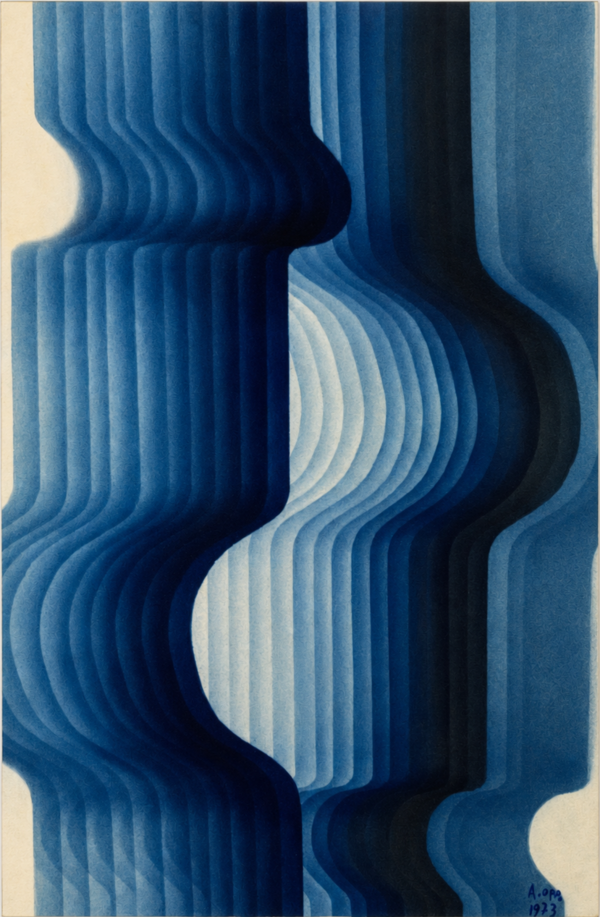
ASO-0011, Onda verticale, 1973. Modulated bands in shades of blue curve and interlock in a vertical rhythm, creating depth and optical movement. The catalogue entry therefore supports an argument about what can be seen, without filling gaps in the documents with hypotheses.
Where an affinity emerges
Sequence and contrast make the field dynamic. Repetition is not ornamental because it directs the gaze and alters the perception of edges.
The convergence therefore concerns an operation, not a physiognomy: how the experience of the painting is organised through diagonal, rhythm and structural colour. Selecting six works avoids treating a single detail as evidence for an entire trajectory.
Considered together, the catalogue entries also reveal Oppo’s plurality. Years, supports and titles do not converge in a definitive formula; the same problem is reopened and altered, sometimes decades apart.
Where the analogy ends
Fruhtrunk retains a severe grammar of bands, angles and colours. Oppo preserves discontinuities, curves, reliefs and allusions, allowing rhythm to change from one work to the next.
The name Günter Fruhtrunk defines an exhibition, critical and technical history that cannot be transferred to Oppo by analogy. Movements and groups are mentioned only to situate the comparative source, not to assign an affiliation retrospectively.
The public scale of the two careers also differs. This asymmetry does not invalidate the comparison, but requires it to operate in both directions: the other artist clarifies a question; Oppo’s corpus offers an independent answer and reveals its limit.
An independent solution
The result is a more precise placement. Fruhtrunk uses diagonal bands and chromatic contrasts to deprive the composition of a stable centre; Oppo encounters the diagonal as one energy among other possibilities and tempers its regularity with material and manual variations. Oppo’s specificity emerges from his mobility between painting, graphic art, relief, object and design, not from assimilation to an already canonical language.
The comparative atlas therefore retains this page among its strong comparisons: the works sustain the comparison, the differences remain decisive, and any future documentary hypothesis can be added without confusing fact and interpretation.
Works examined
Catalogue works that provide the visual evidence for the argument.


Sources and selected bibliography
- museum Museum of Modern Art, Günter Fruhtrunk and The Responsive Eye
- Archive document Augusto Oppo Archive, digital catalogue raisonné of the works, 582 entries consulted
- Archive document Augusto Oppo Archive, Augusto Oppo: a lateral modernity
Critical comparison proposed by the Archive. No documents have been found attesting a direct relationship between Augusto Oppo and Günter Fruhtrunk; formal affinities, historical data and interpretative hypotheses are kept distinct.